Design Audit
A Finance application audit
Project by Hriday Checker
BRIEF
Below is an example of a design audit conducted for a finance learning startup, presented in bullet points for quick reference.
SUCCINCT POINTS
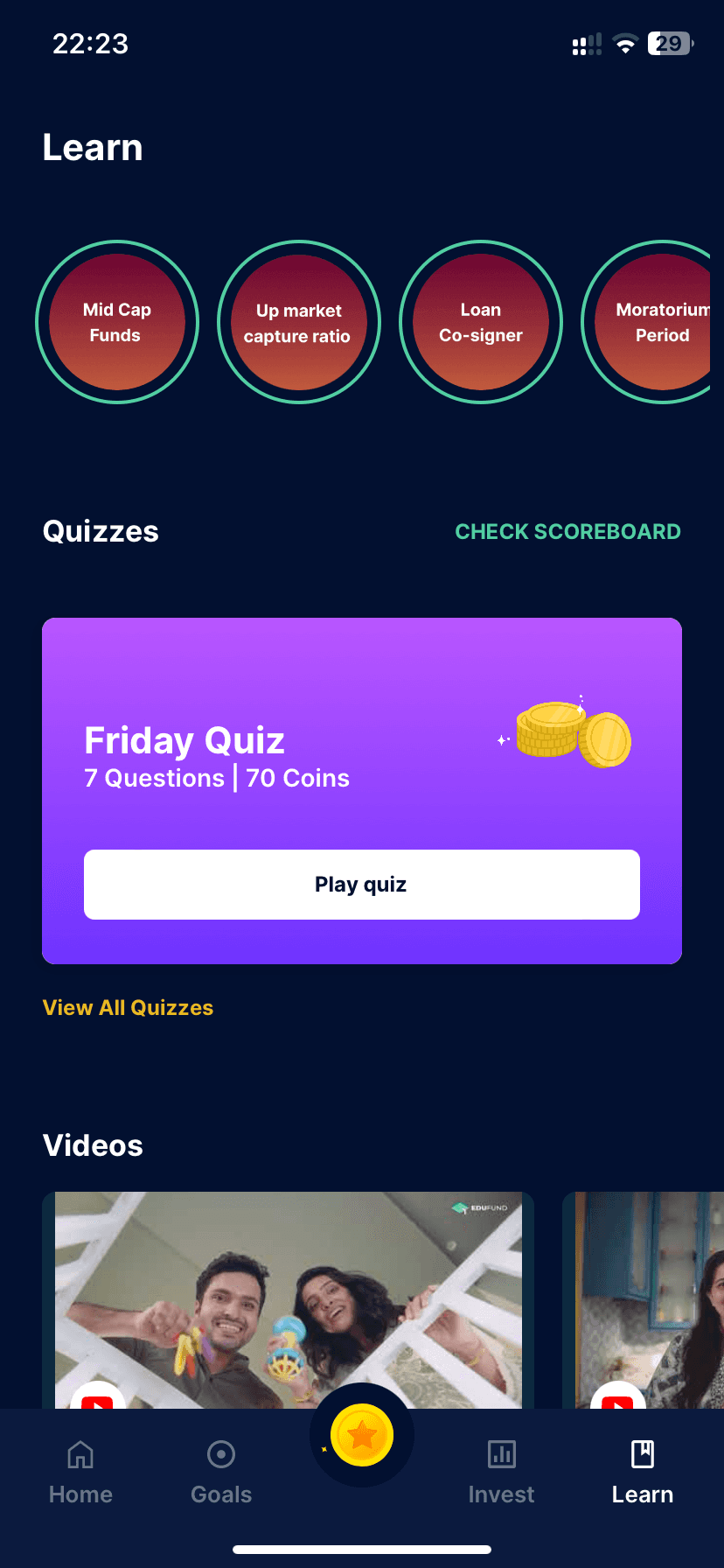
Navigation Clarity: Make it clear if "Learn" categories are clickable; consider icons or chevrons.
Contrast for Readability: Improve text-background contrast, especially on circular buttons.
Active Tab Indicator: Enhance the visual cue for the active "Learn" tab.
Information Density: Space out "Learn" categories for a less crowded look.
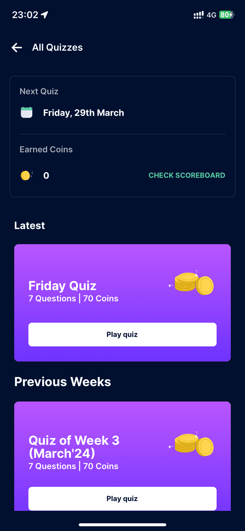
Gamification Explanation: Clearly explain the role and value of coins and quizzes.
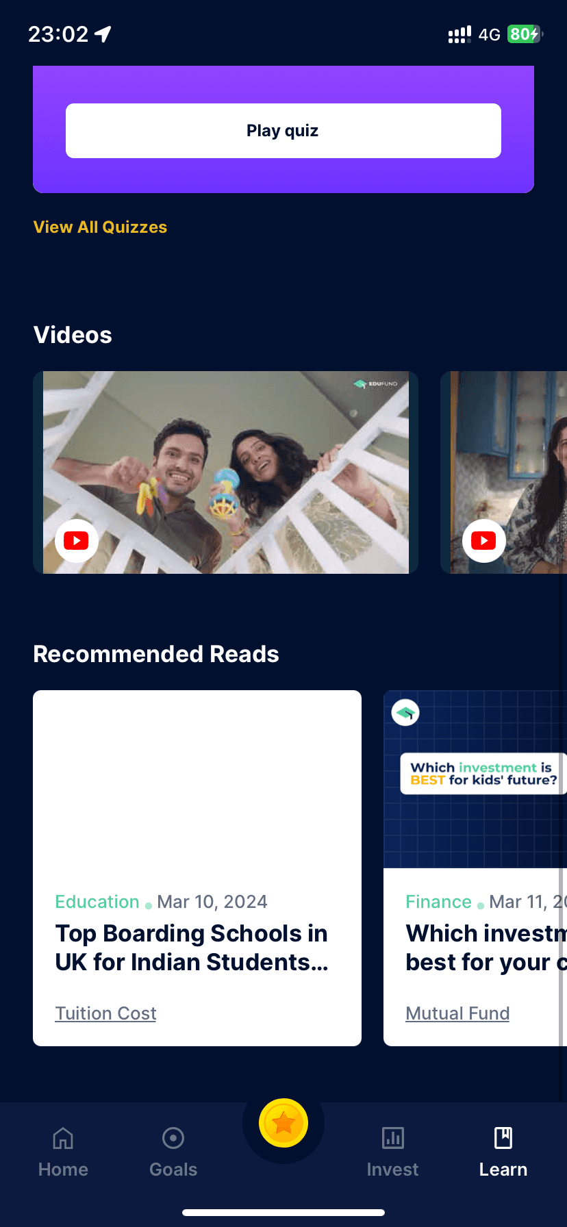
Call-to-Action Buttons: Increase visibility for "Play quiz" and "View All Quizzes."
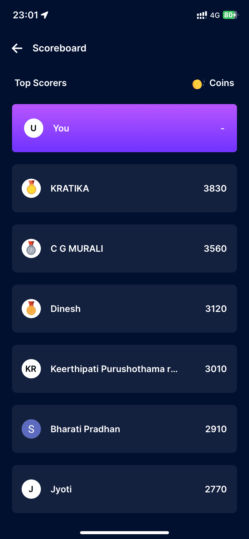
Scoreboard Placement: Integrate or reposition "CHECK SCOREBOARD" to avoid confusion.
Technical Jargon: Simplify or explain terms like "Up market capture ratio."
Accessibility Consideration: Ensure colors and fonts are accessible to all users.
Imagery Diversity: Use a range of images to represent varied content in "Videos."
Consistent Aesthetics: Ensure all interactive elements share a cohesive design language.
User Testing: Regularly test with users for feedback on navigation and content clarity.
Performance Optimisation: Ensure images and content load quickly to improve UX.
Interactive Feedback: Use micro-interactions to indicate clickable elements.
Error State Handling: Design clear messages for network issues or content loading errors.
Progressive Disclosure: Offer more detailed content on demand to avoid overwhelming new users.
Cultural Sensitivity: Ensure content and imagery are inclusive and culturally diverse.
Comprehension Aids: Include tooltips or a glossary for complex financial terms.
Hierarchy Refinement: Refine text size and weight to establish a clear visual hierarchy.
Color Palette Review: Evaluate the colour palette for emotional impact and brand alignment.
Content Updates: Indicate clearly when content is new or has been updated recently.
Alignment & Grid Use: Stick to a grid for alignment to keep the layout clean and organised.
Button Accessibility: Make sure tap targets are large enough for easy interaction.
User Control: Allow users to customise their learning experience where possible.
THANK YOU
If there’s any question please kindly to ask me. Let’s Discuss
waffledesigns12@gmail.com or +91 96991 82986